Catalogue & Social Assets /
Client: C Magazine
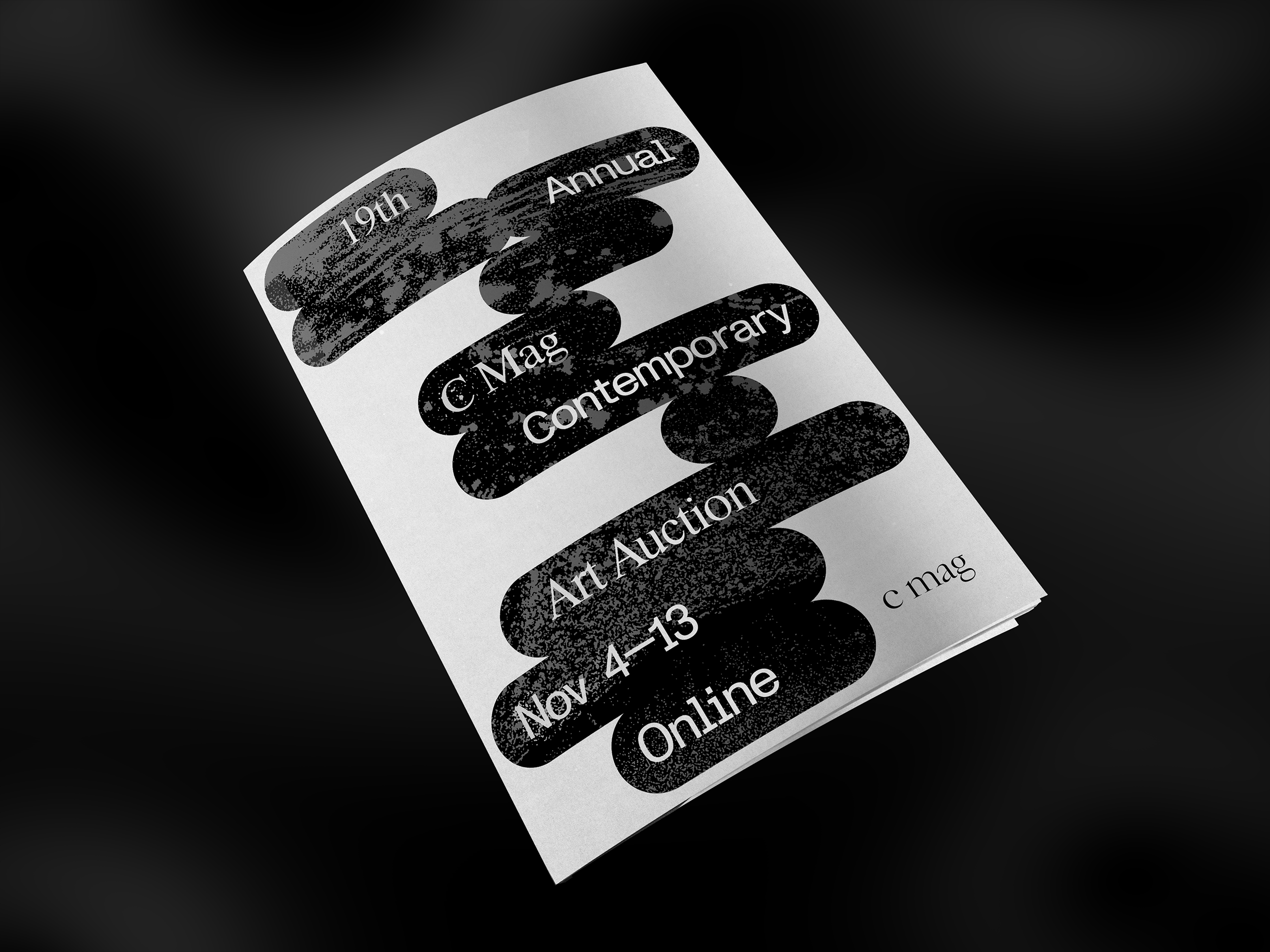
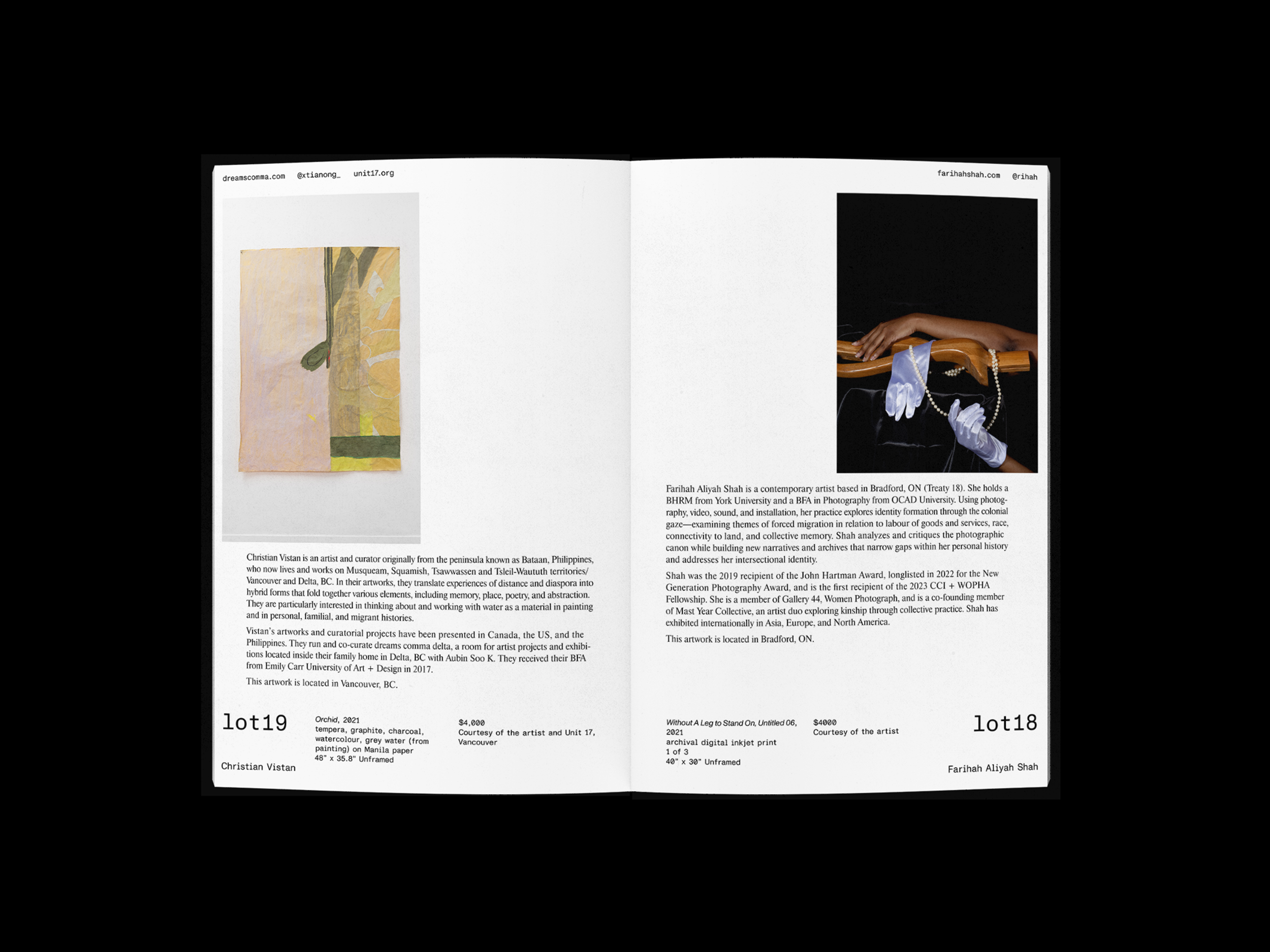
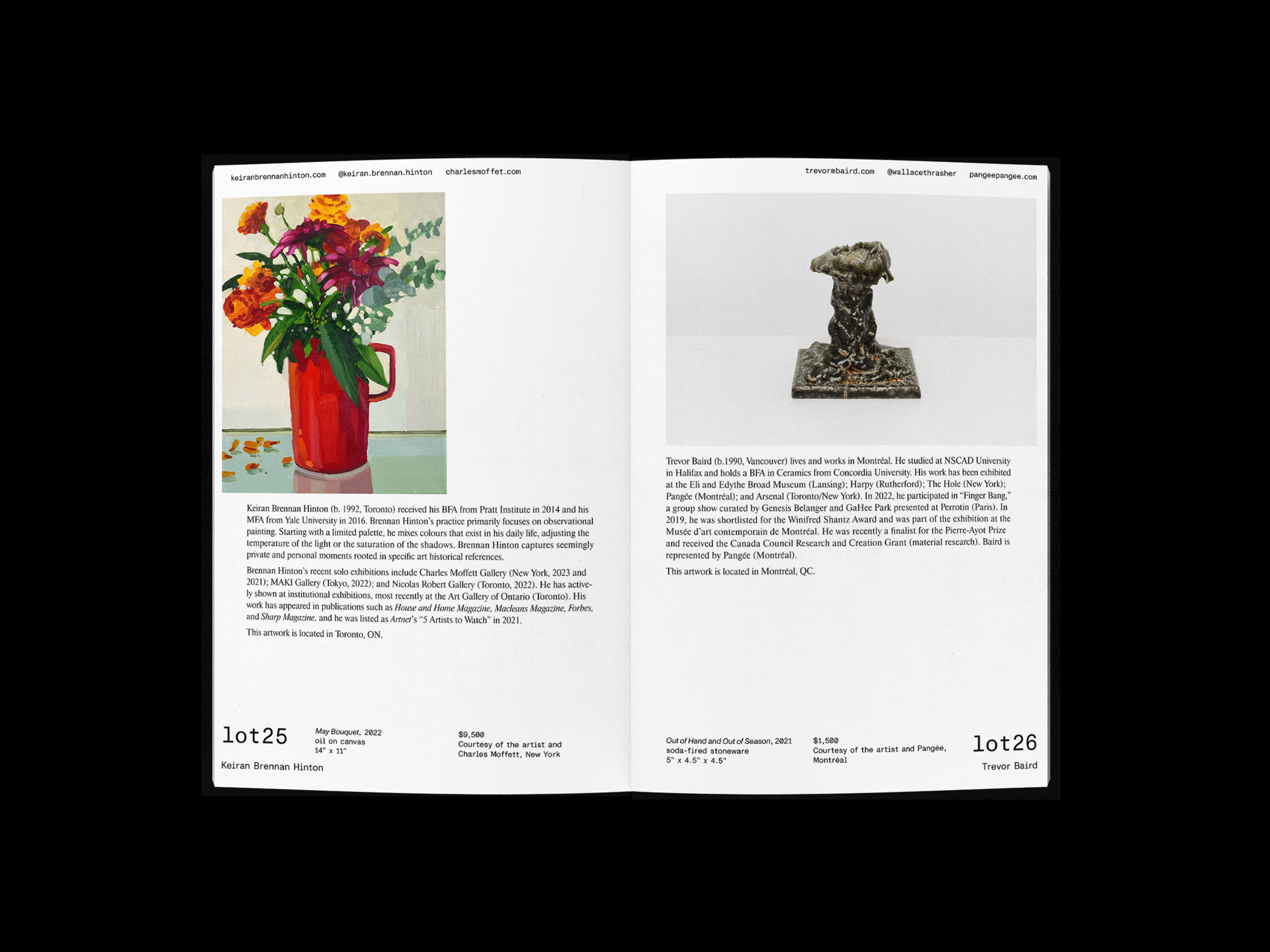
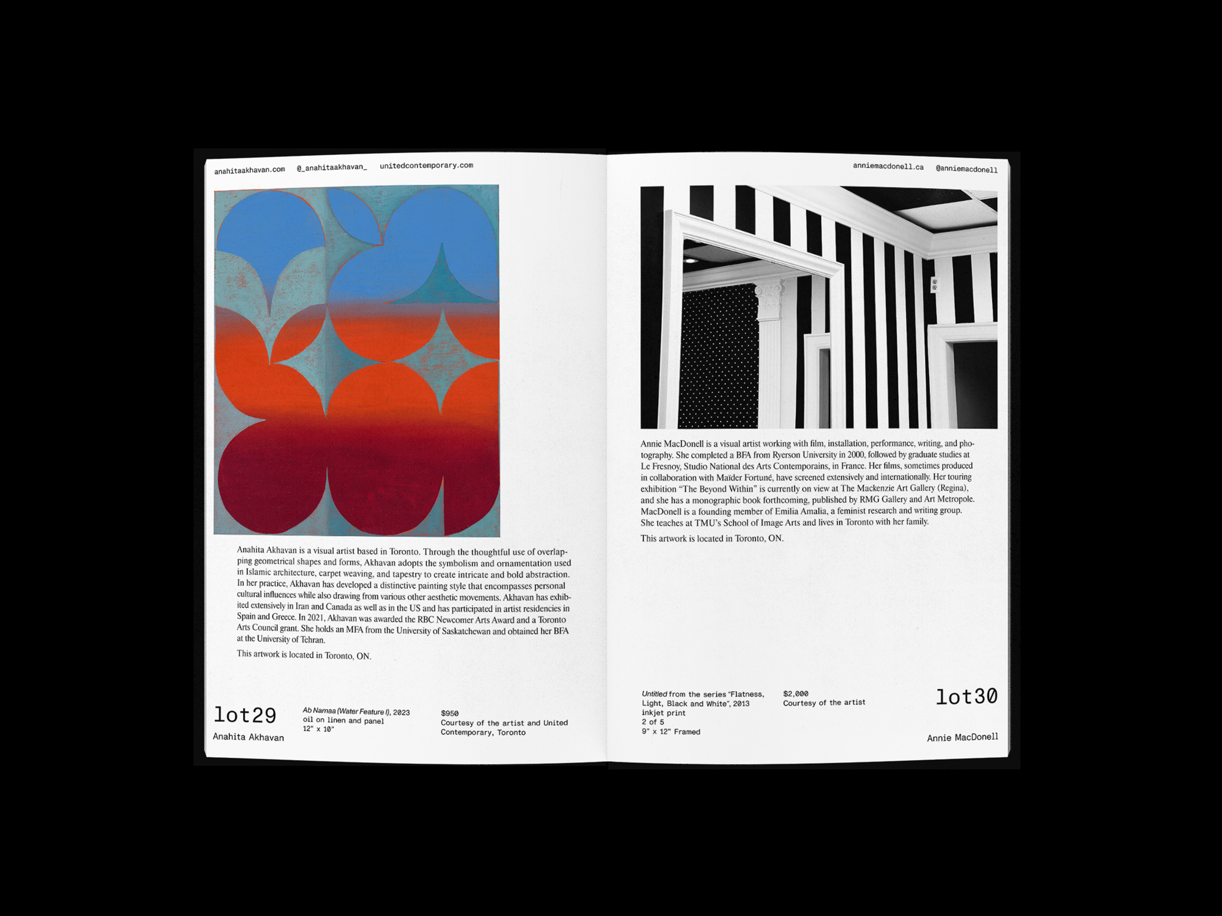
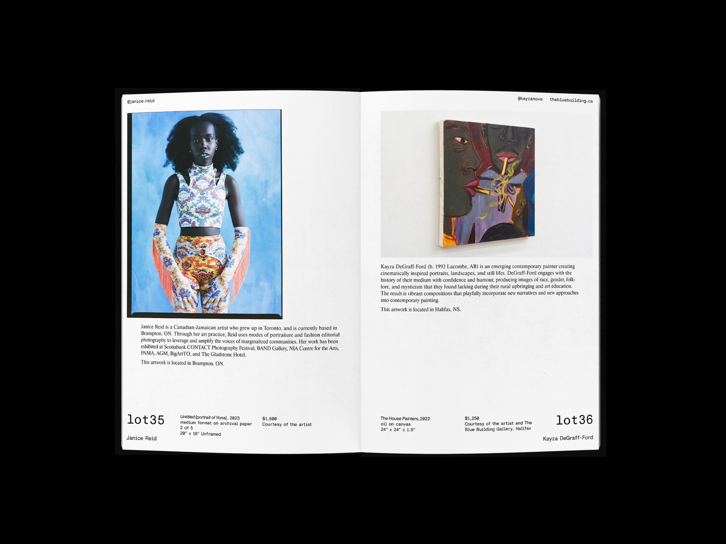
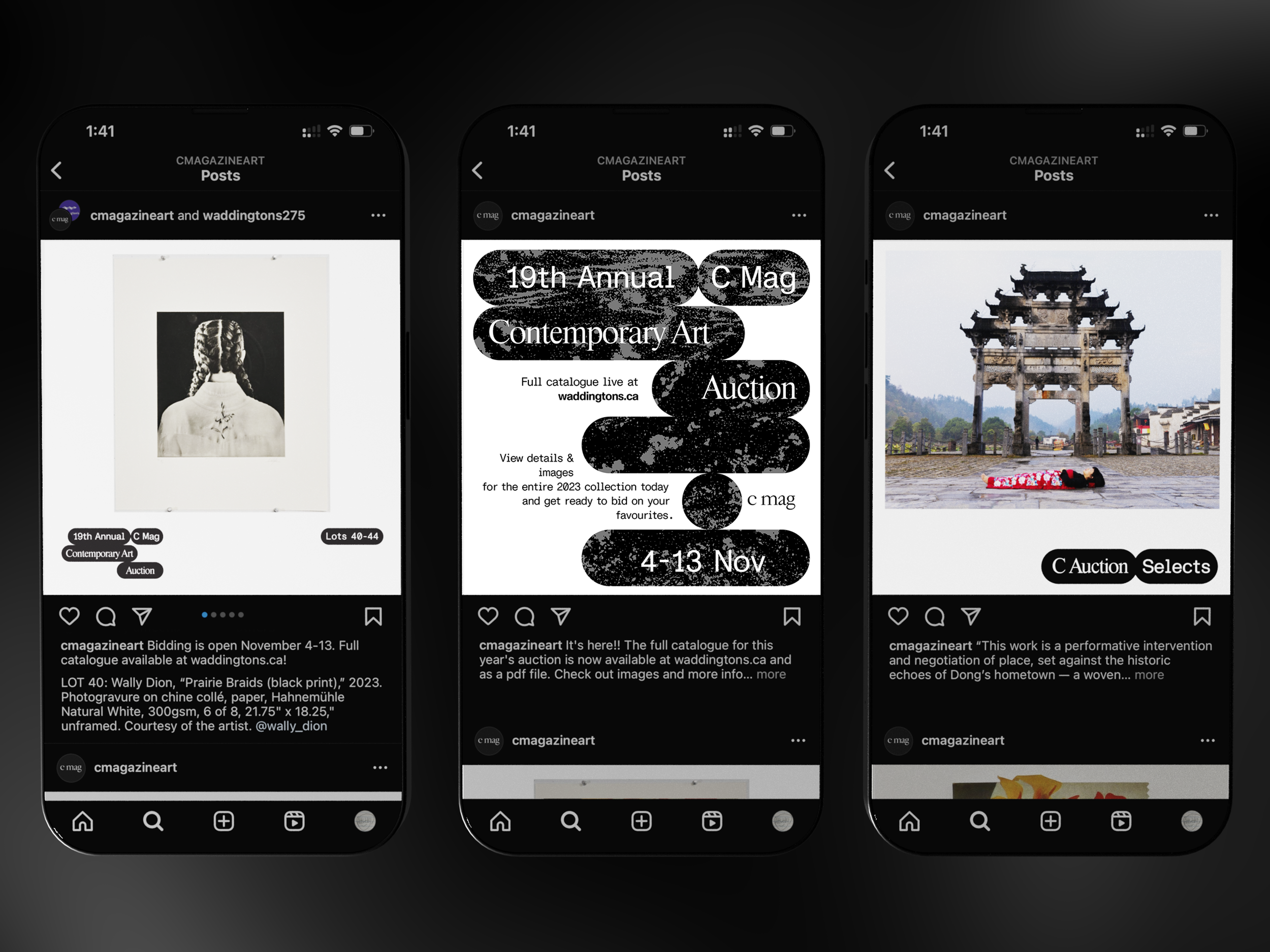
Every year, C Magazine hosts an art auction featuring works generously donated by artists working in painting, photography, sculpture, textile, & beyond; profits directly support C Magazine in its mission to engage our community through Canadian-led contemporary art & art writing.
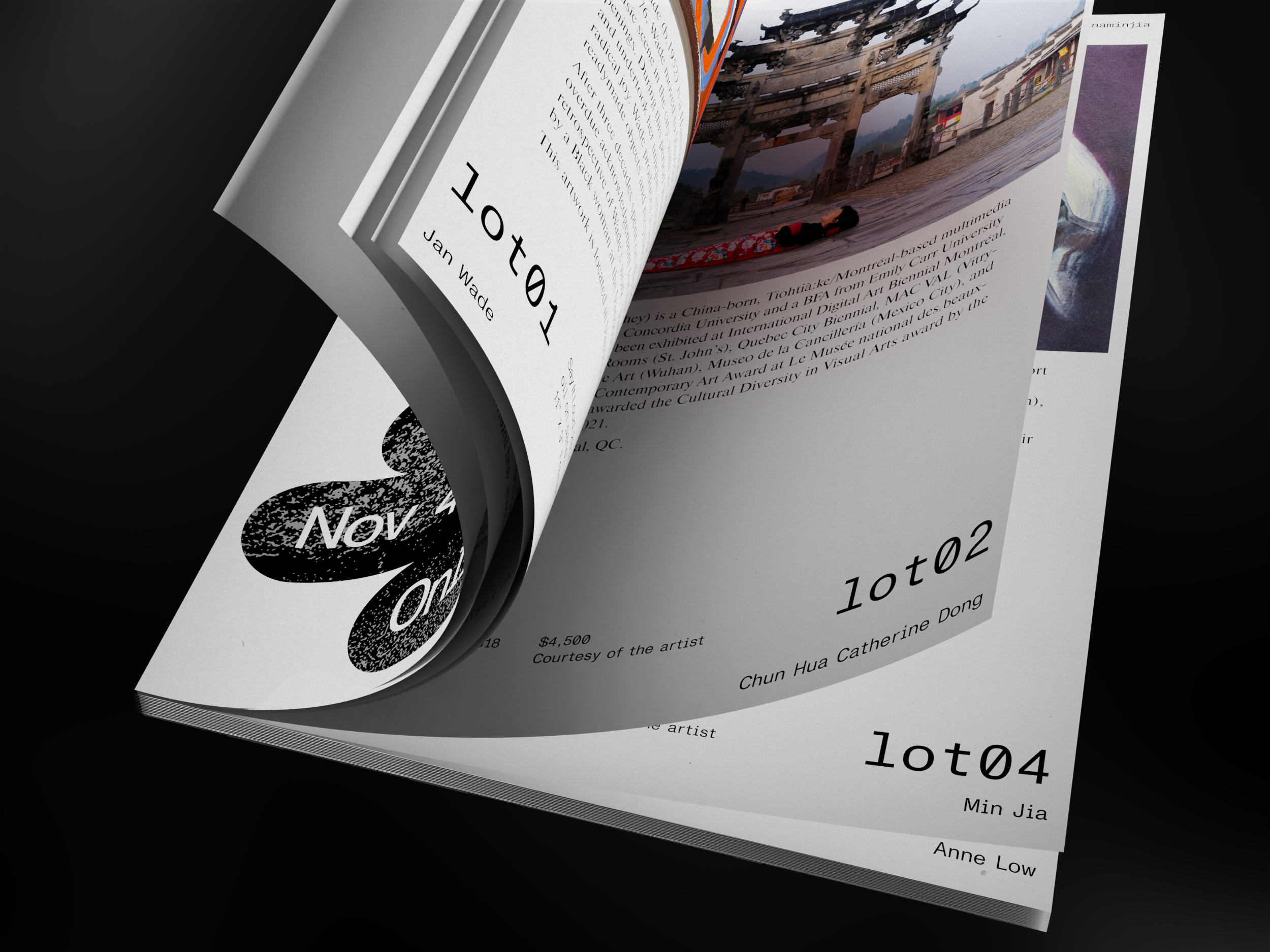
Speech bubble shapes visually organized into something not unlike back-and-fourth comic dialogue created the basis of the catalogue's design language. A traditional auction is snappy, with a speedy back-and-fourth carried out between the auctioneer & audience; using the classic visuals of speech bubbles to embody auction "conversation" is a playful way of embodying the event.
Design Director
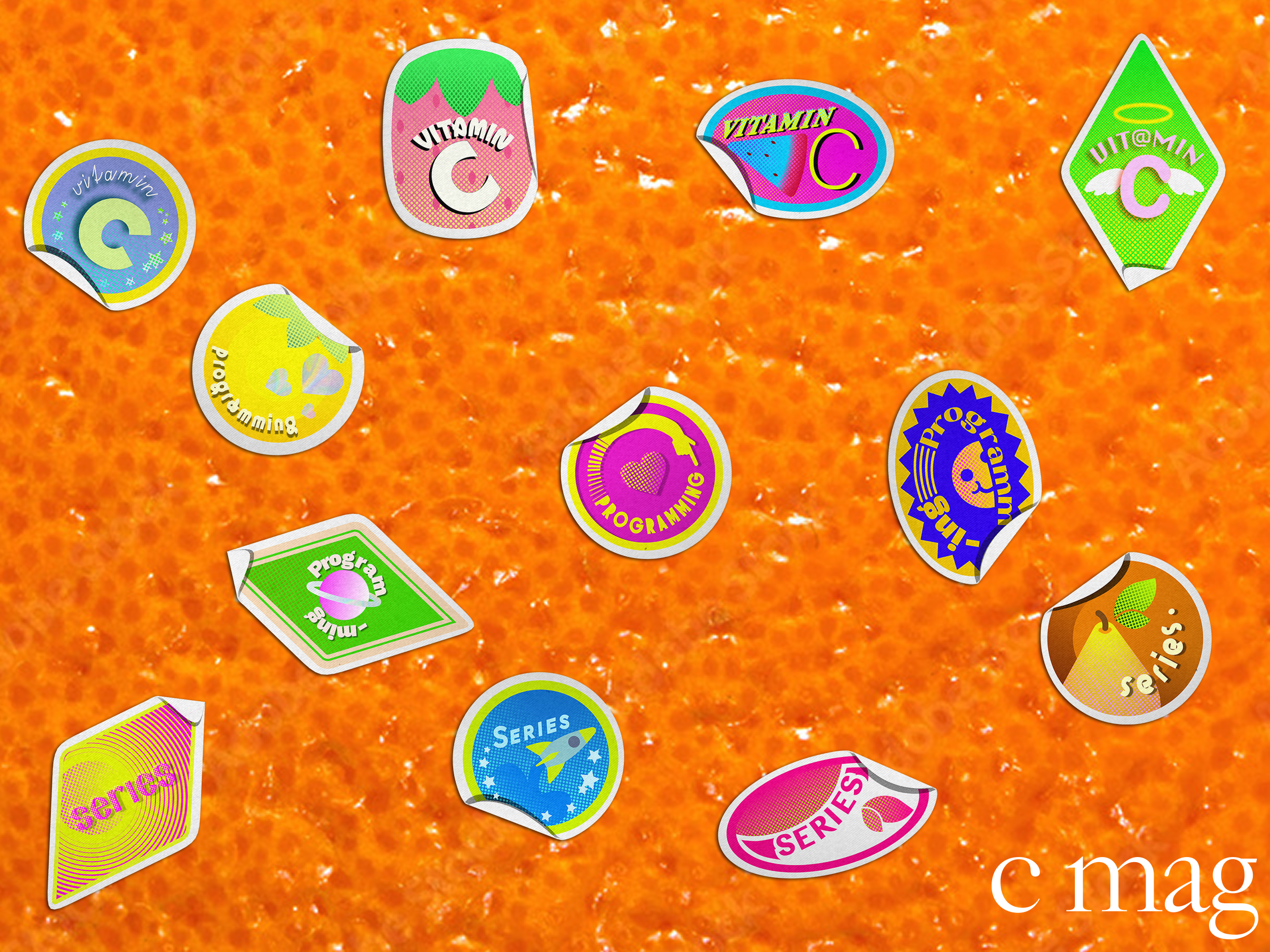
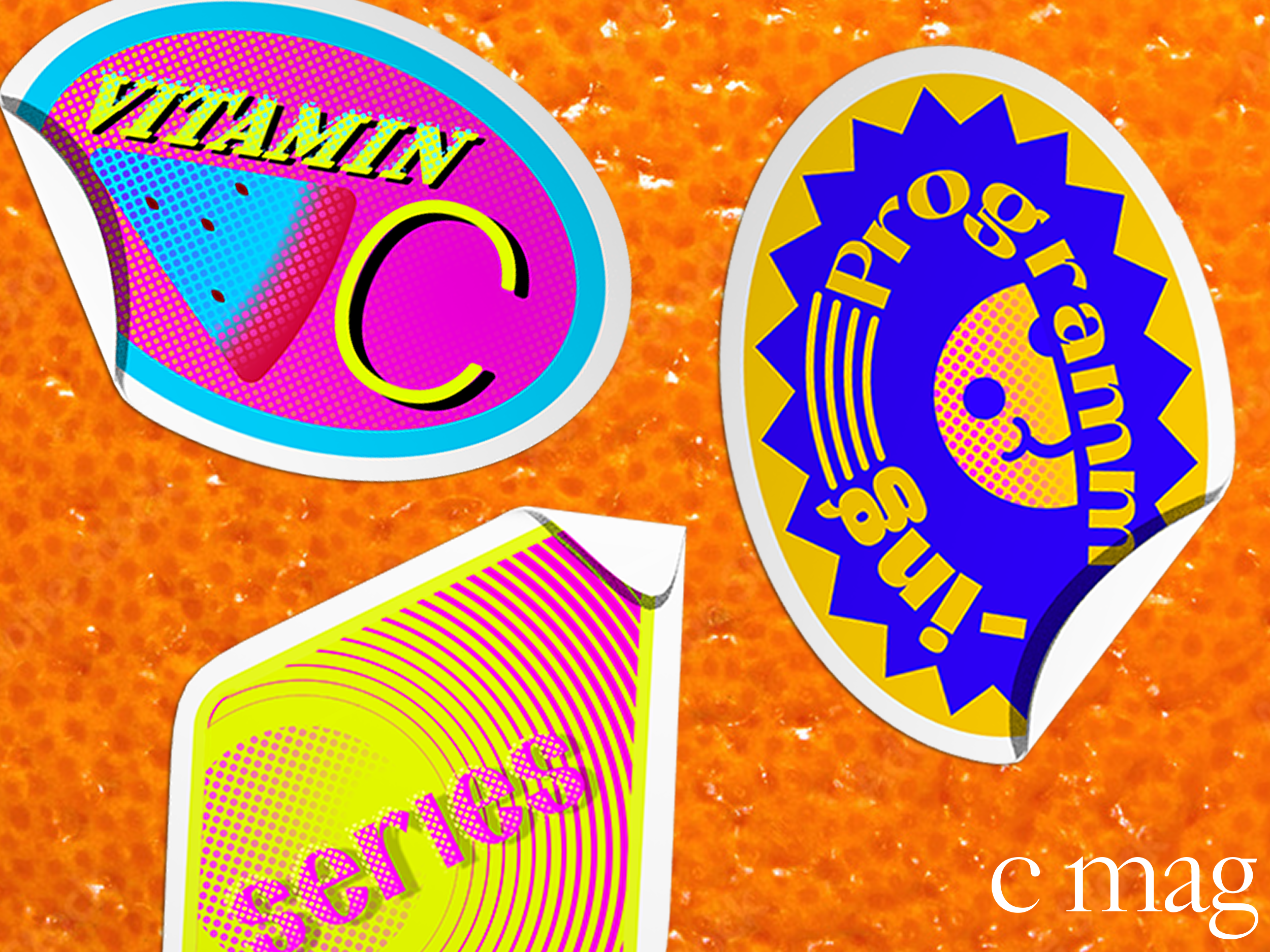
Client: C Magazine
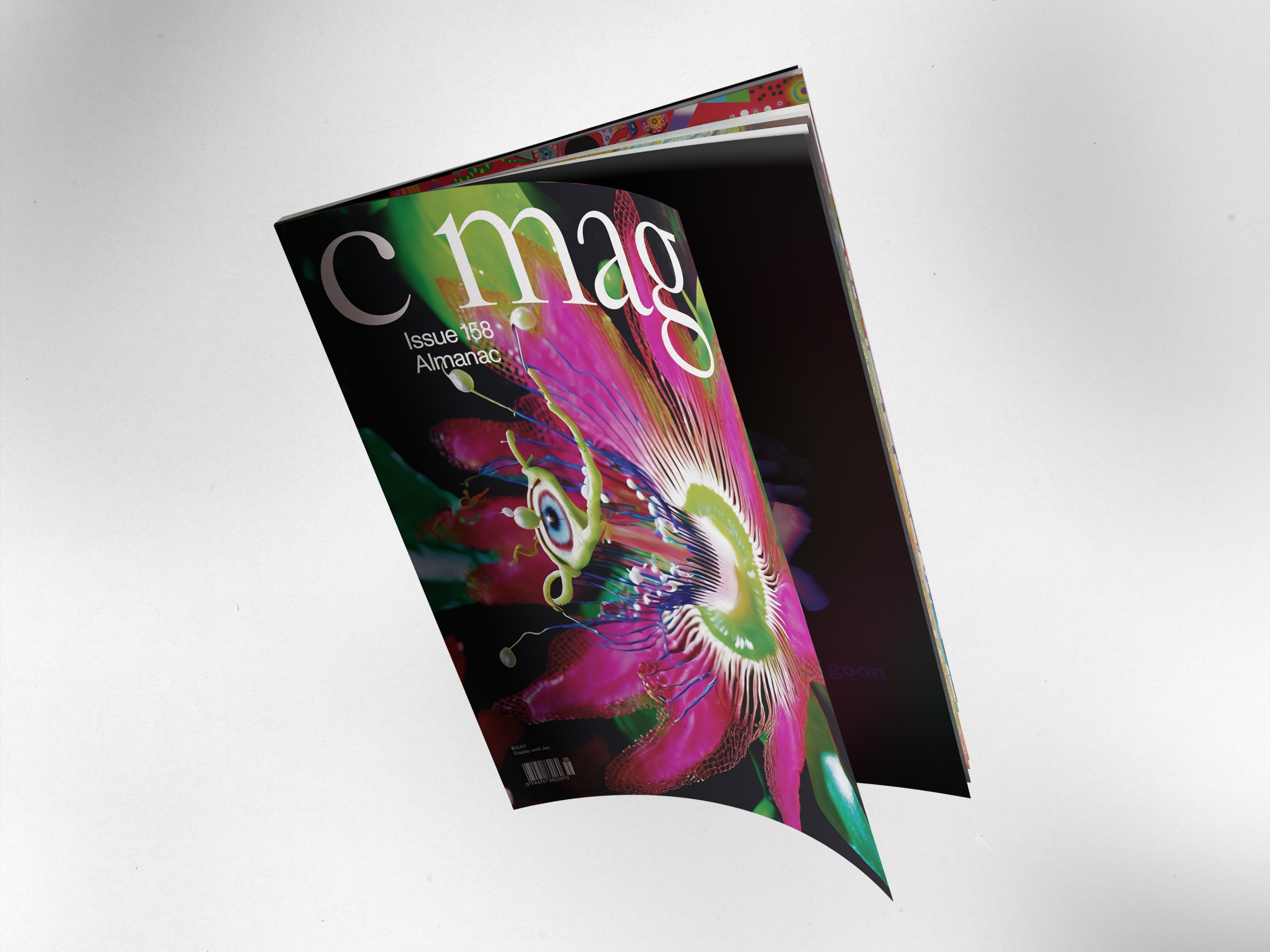
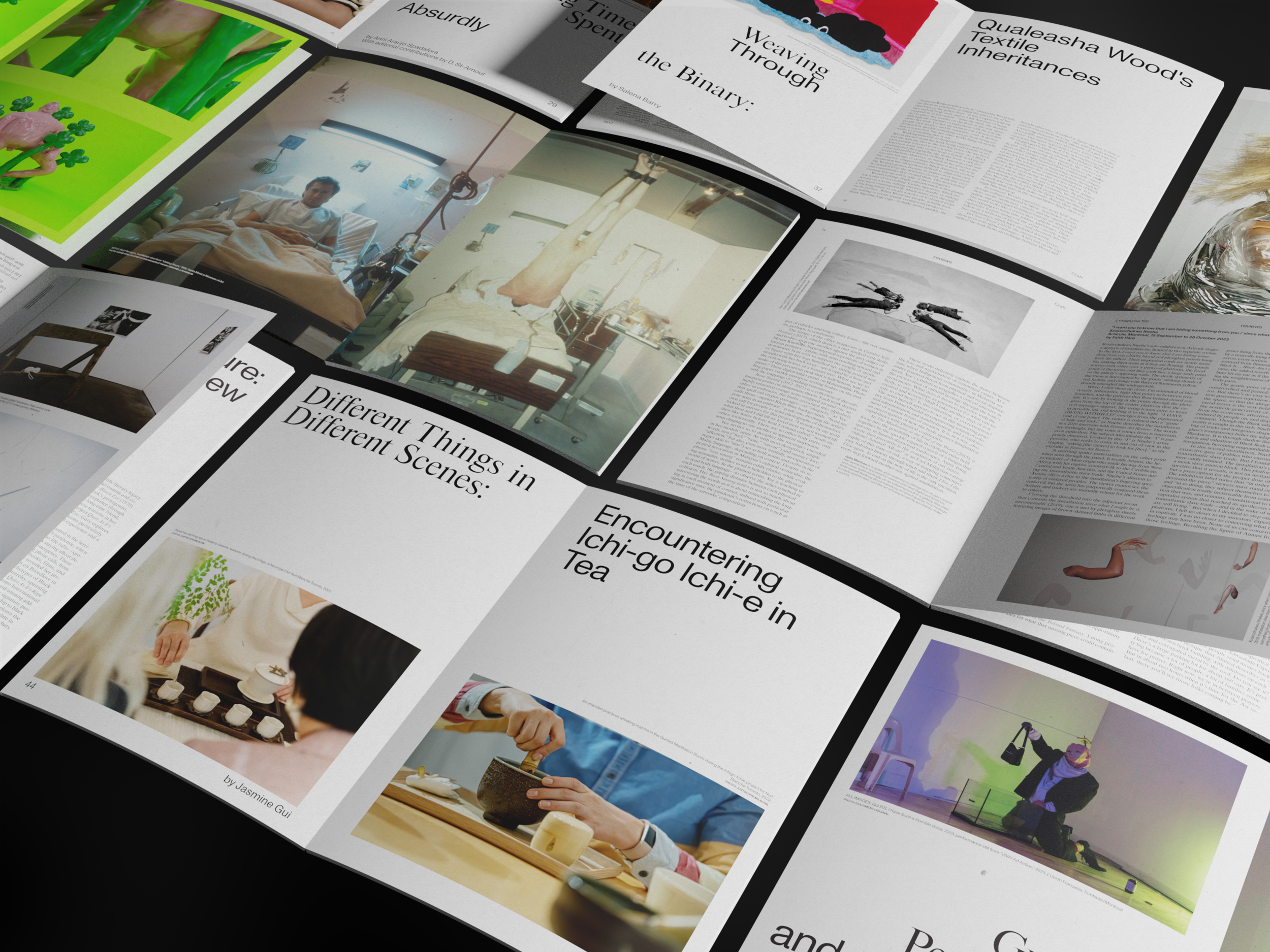
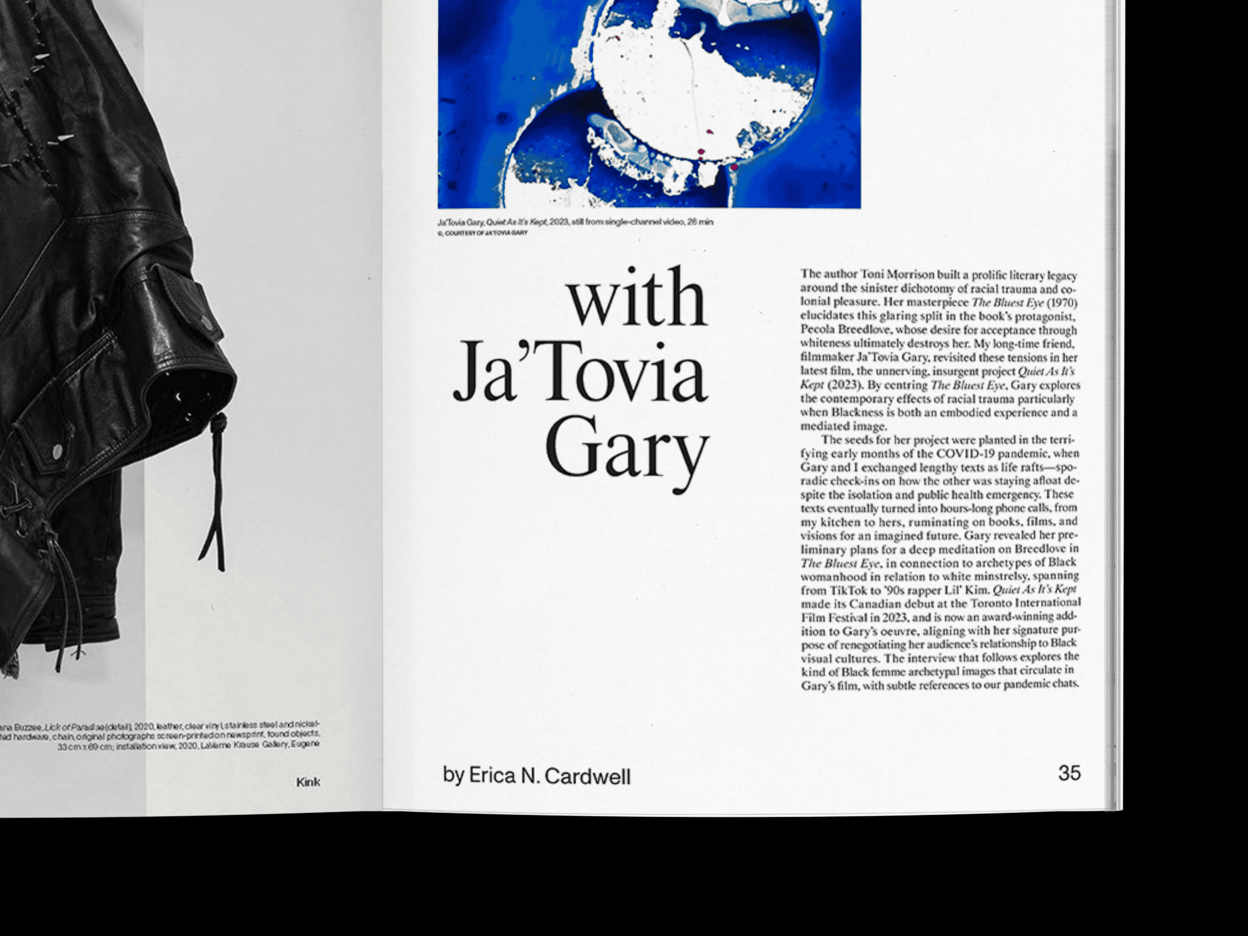
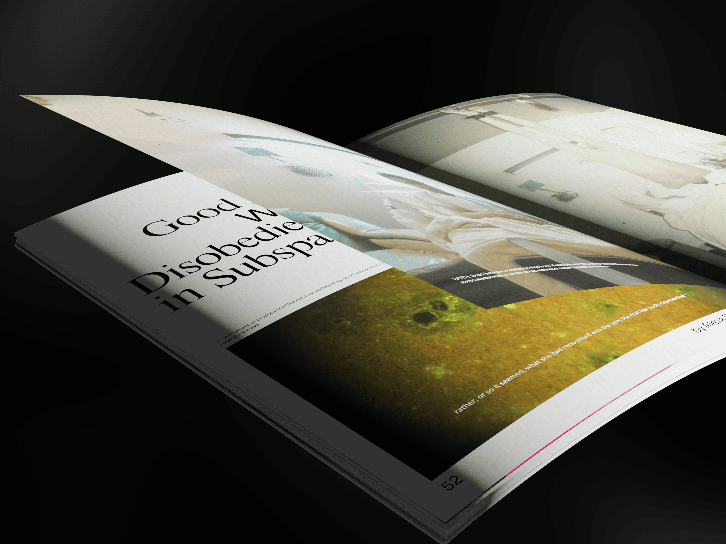
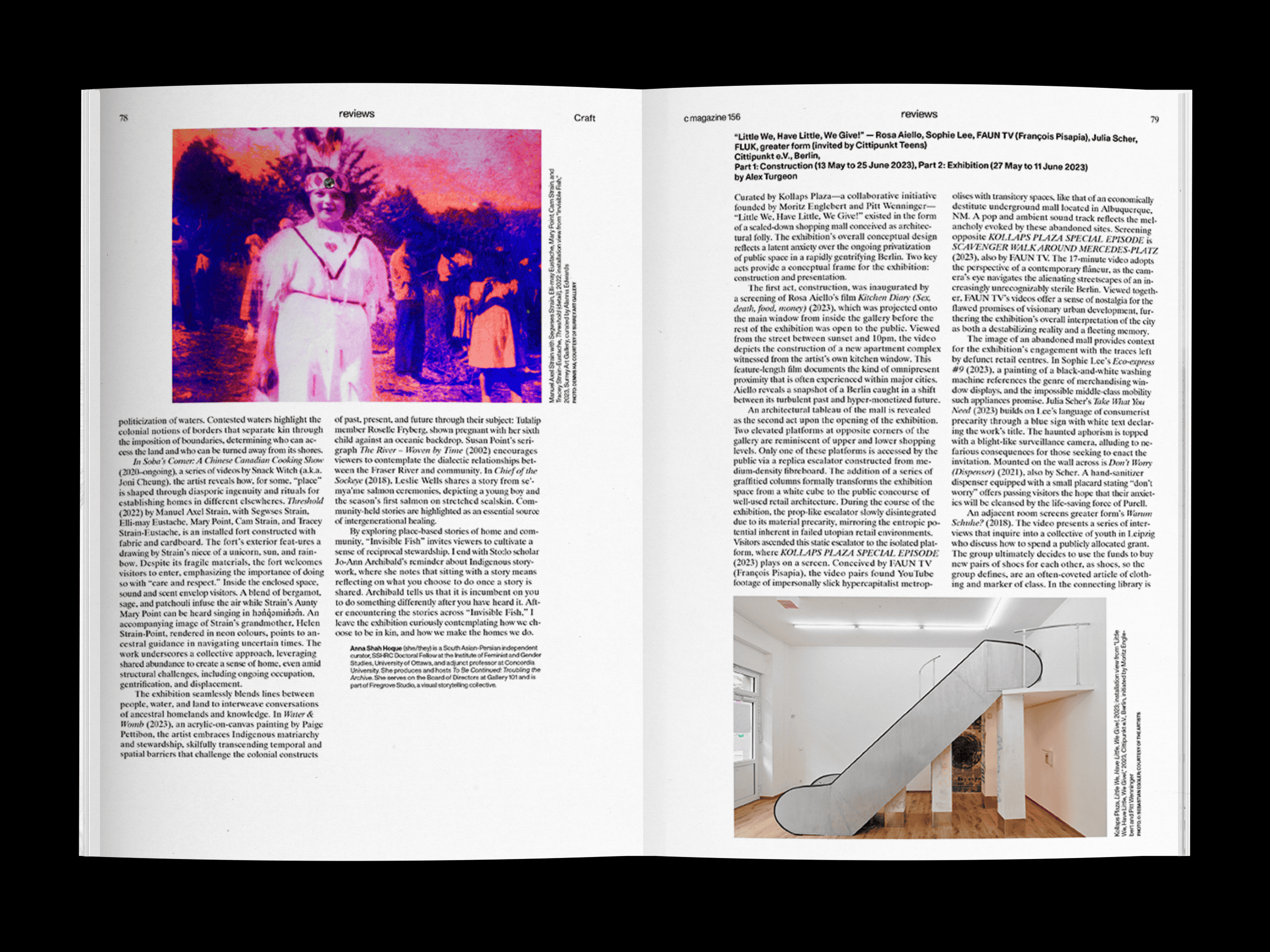
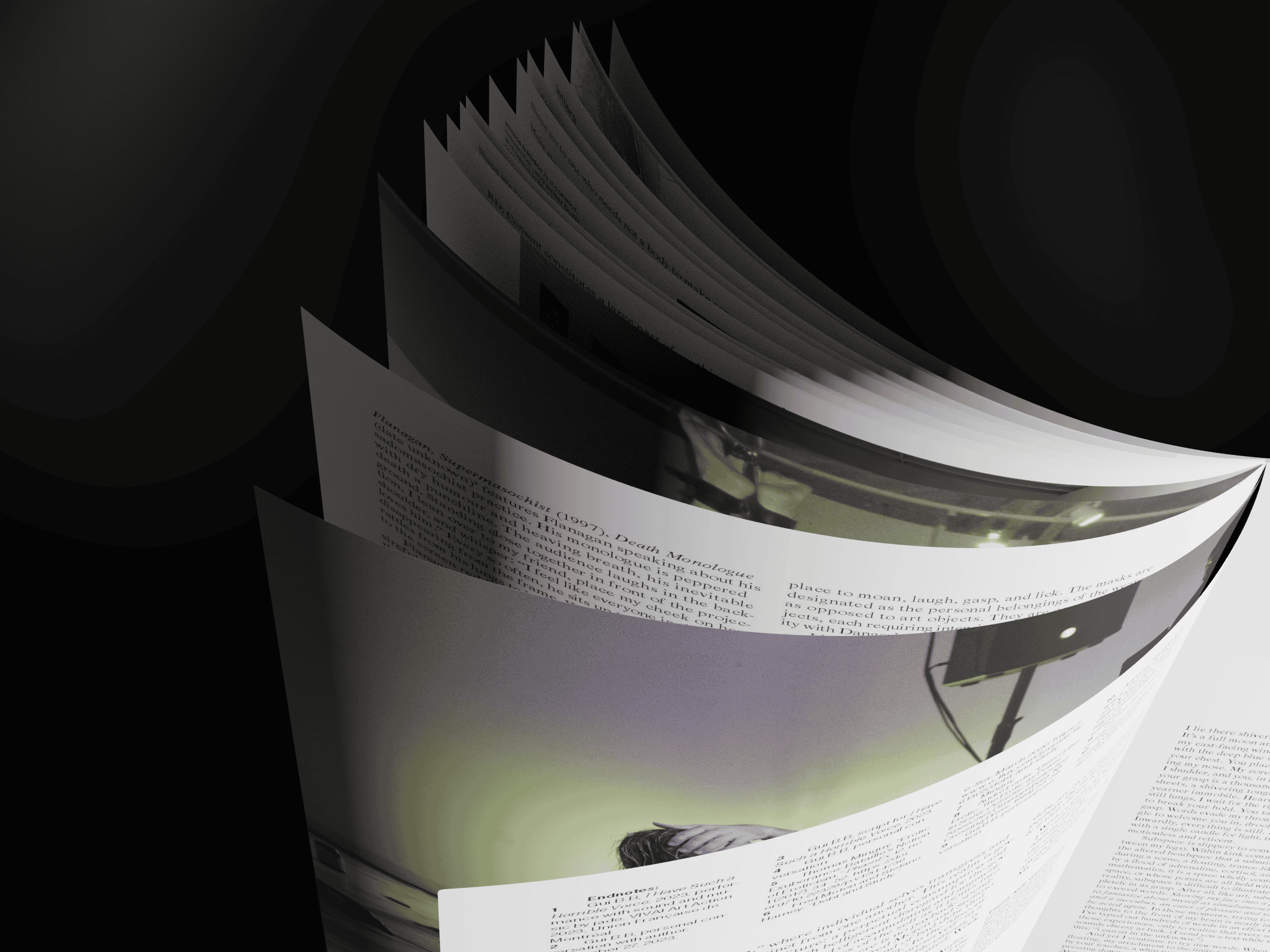
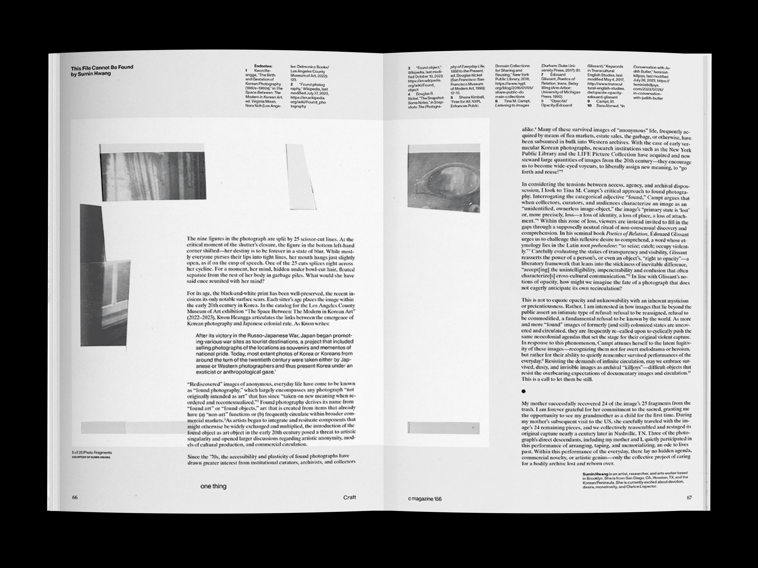
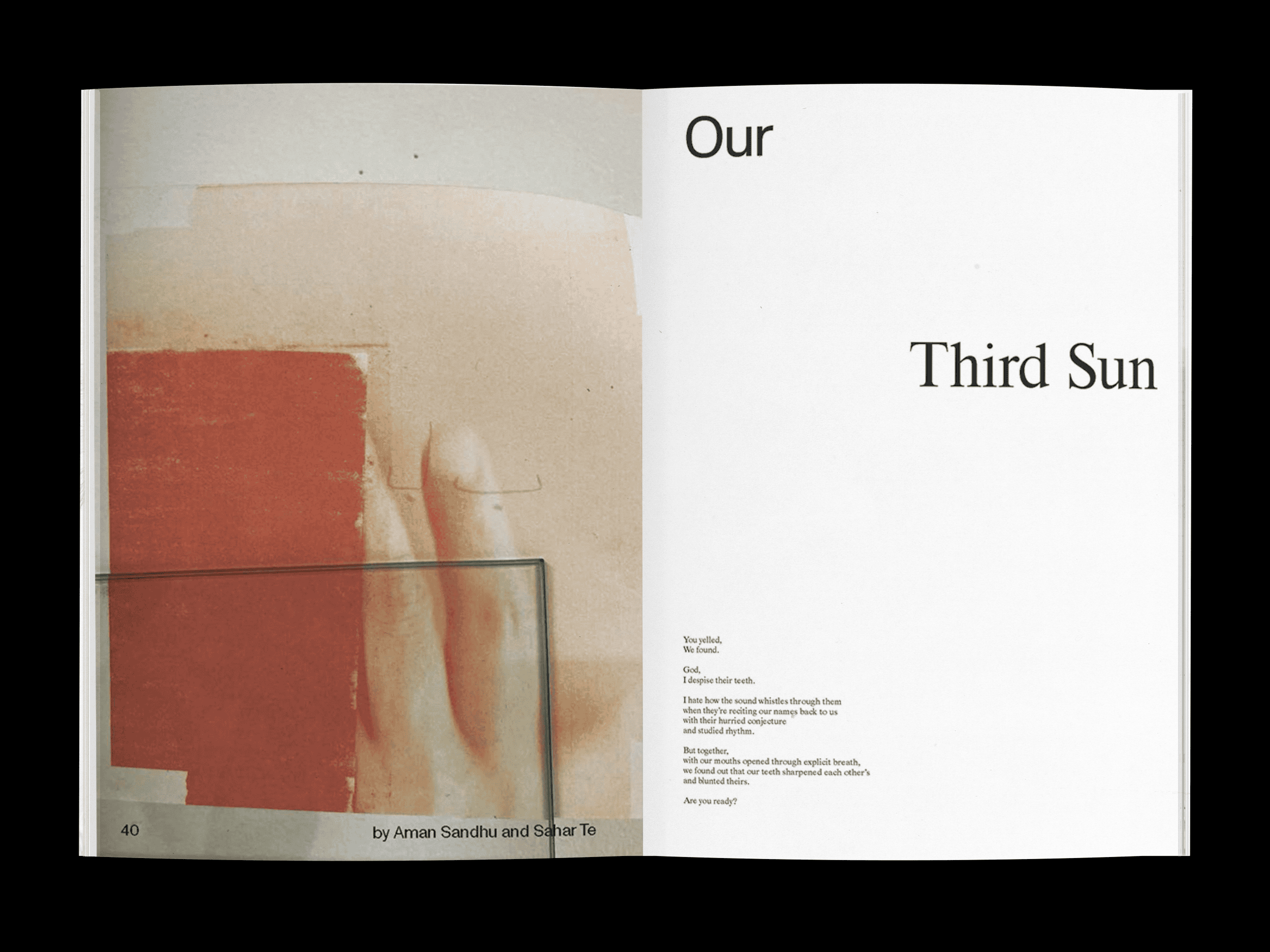
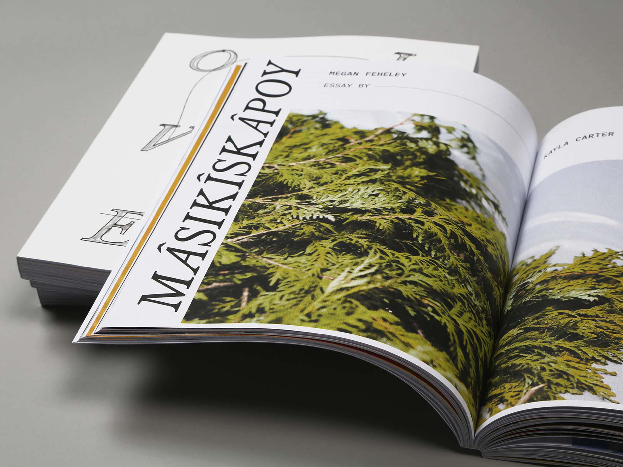
C Magazine (est. 1984) is Canada’s foremost
critical periodical on contemporary
art & culture. Covering Canadian
& international art, C includes
among its contributors nationally
& internationally renowned critics,
curators, scholars, & artists.
Each issue’s specific thematic
focus offers a forum for the in-depth
exploration of a relevant topic. C’s print edition is published three times a year, & distributed throughout Canada & Europe.