hwa-jin jun
info
...is an art director / senior graphic des­ign­er born in the year of the dog. She is a cons­­um­­mate hik­­ing am­­ateur, and enjoys spend­ing her time out­­doors ten­­d­ing to her bud­d­ing ba­­ck­­yard veg­­e­­table gard­­en. At her core, she is a ten­­aci­ous ex­plor­­er and co­ns­tant learn­er; Hwa‑Jin adept­ly trans­­lates her un­­abash­­ed cur­ios­ity and un­con­ventional st­yle into her prac­­tice in­vol­v­ing inter­­active dig­i­tal ex­p­er­­iences and pro­cess-driven, collage-like des­igns. She is cur­rent­ly the des­ign dir­ector of C Magazine, one of the foremost print mags for contemporary art and criticism.
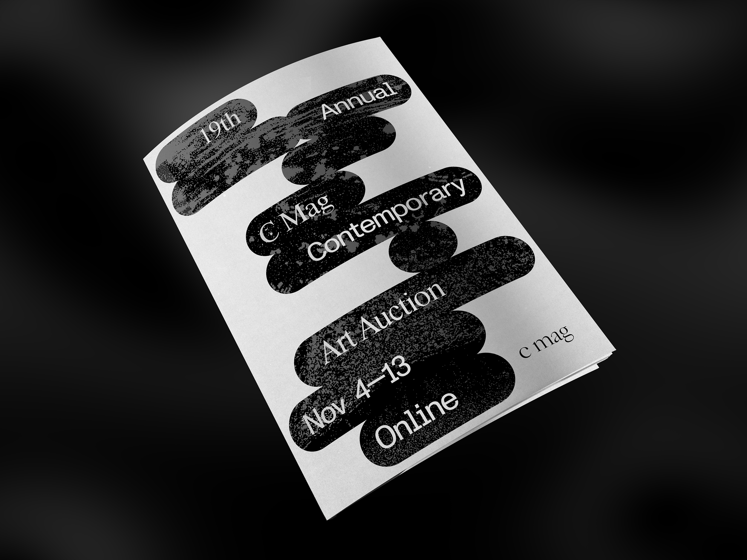
Print Magazine Redesign /
Design Director

Client: C magazine

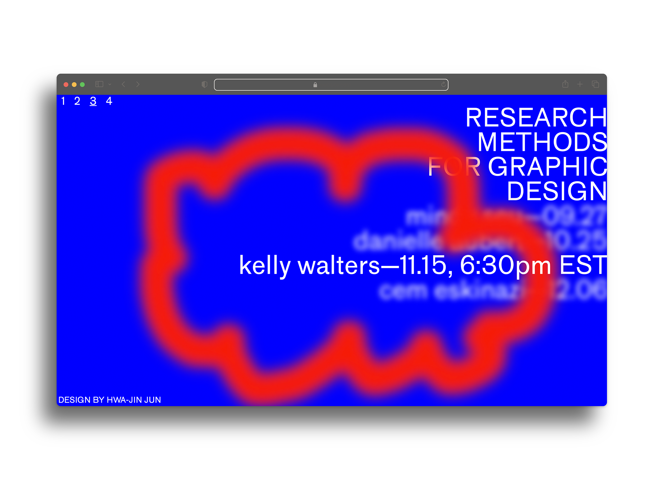
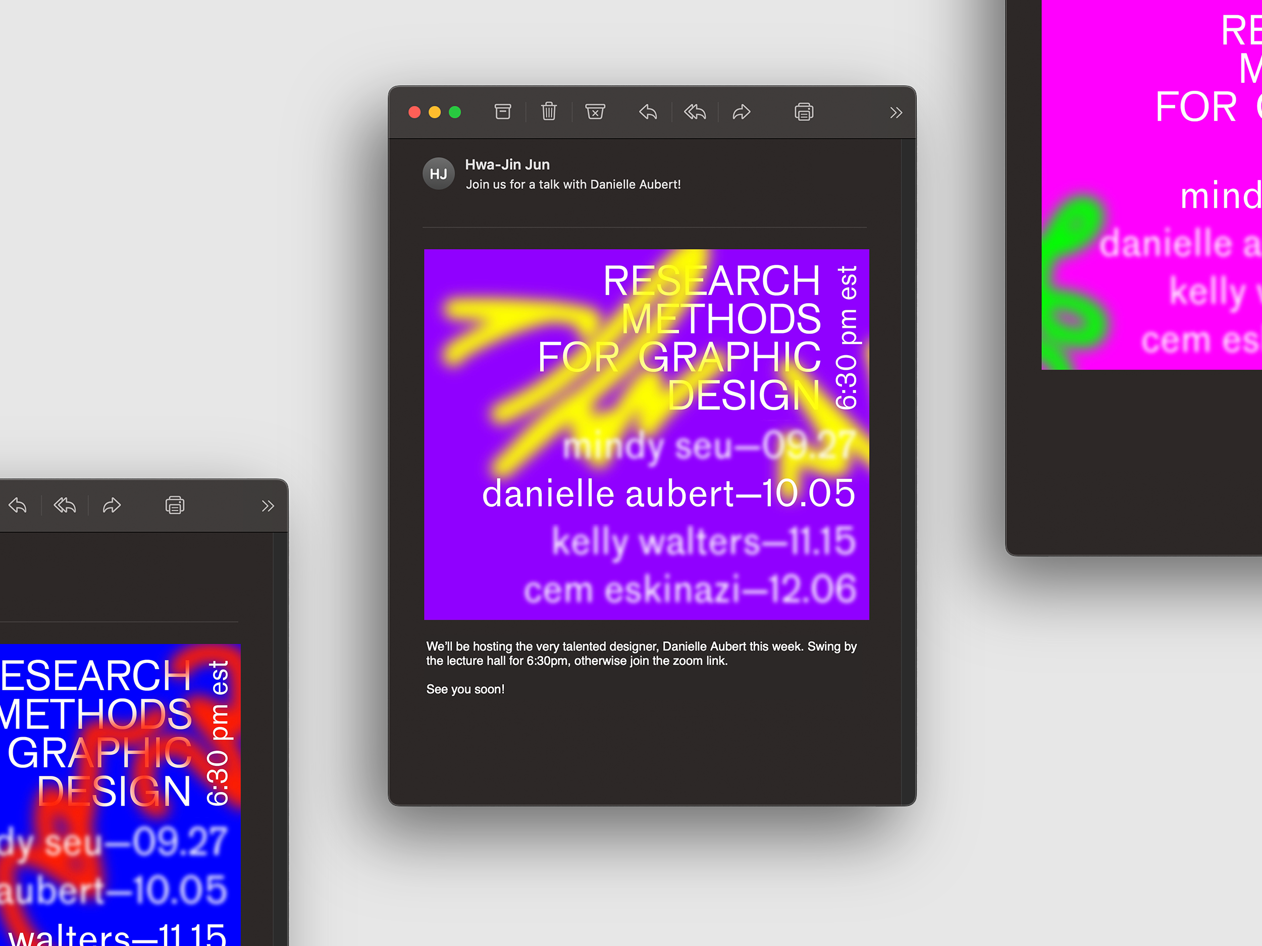
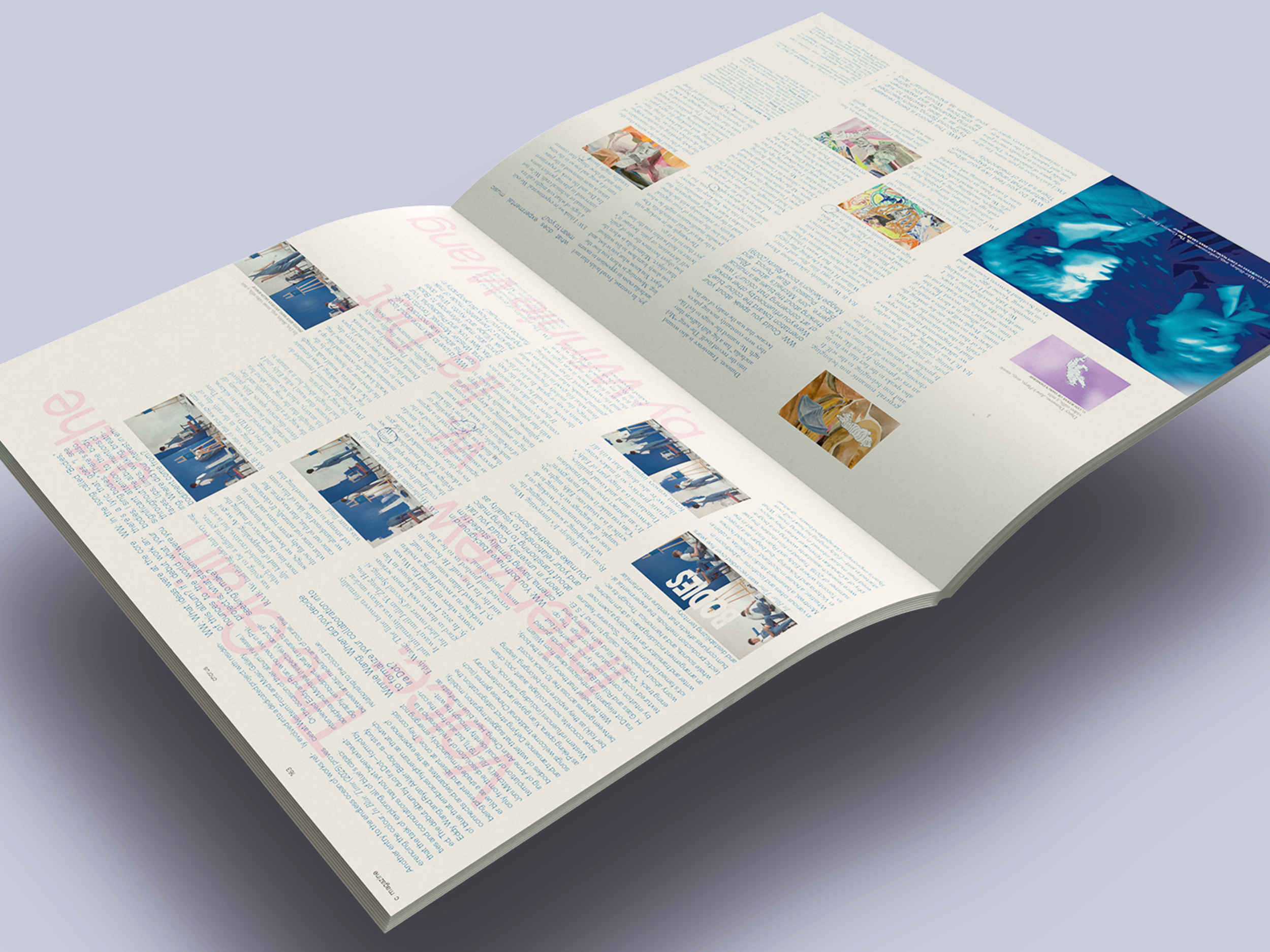
Issue 163 introduced a complete redesign of C Magazine's print issues. As C's design director, I led an art direction focused on analog textures and motifs, with the aim of bridging the often ignored gap between art/written pieces and their designed layouts.
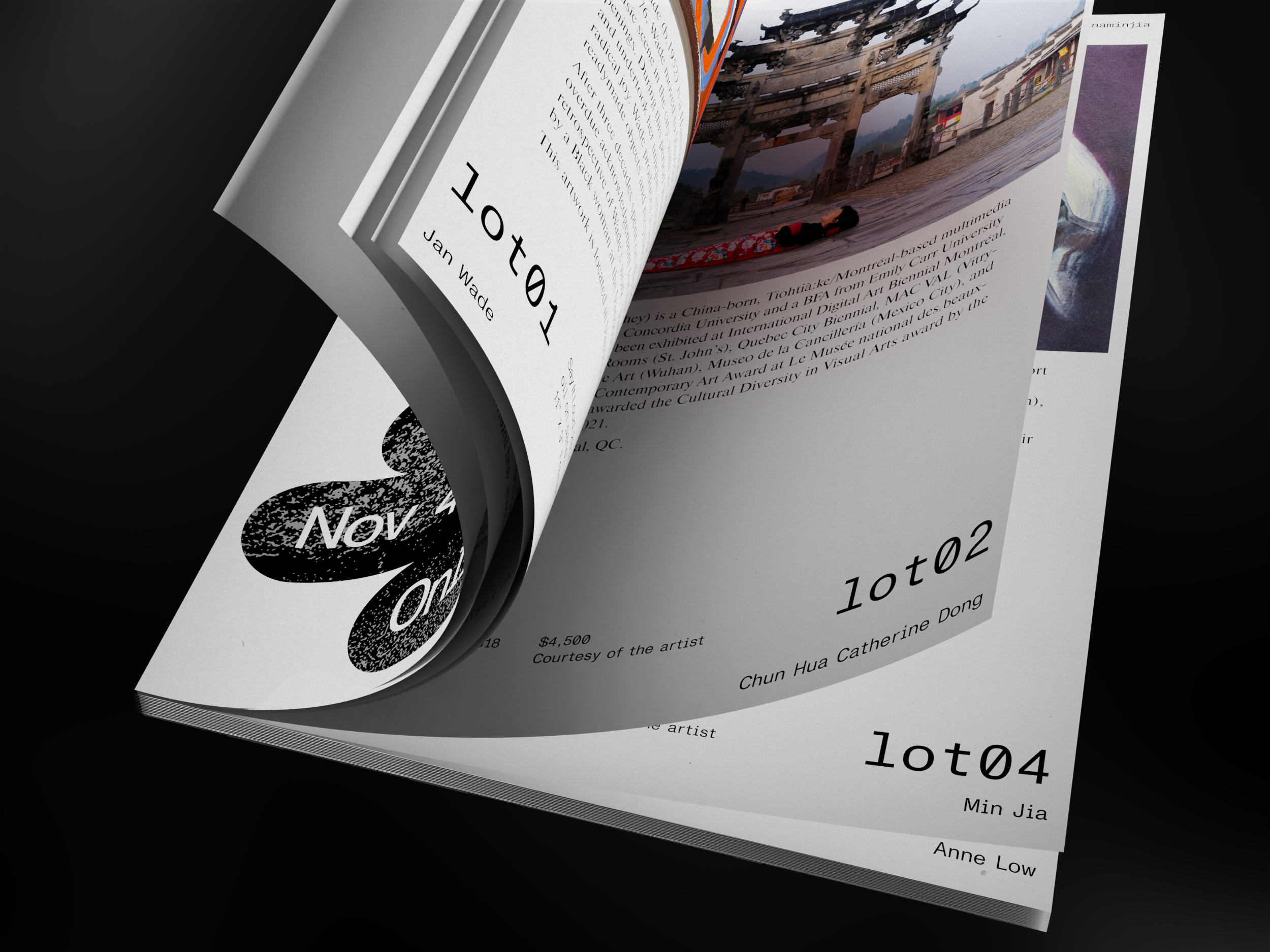
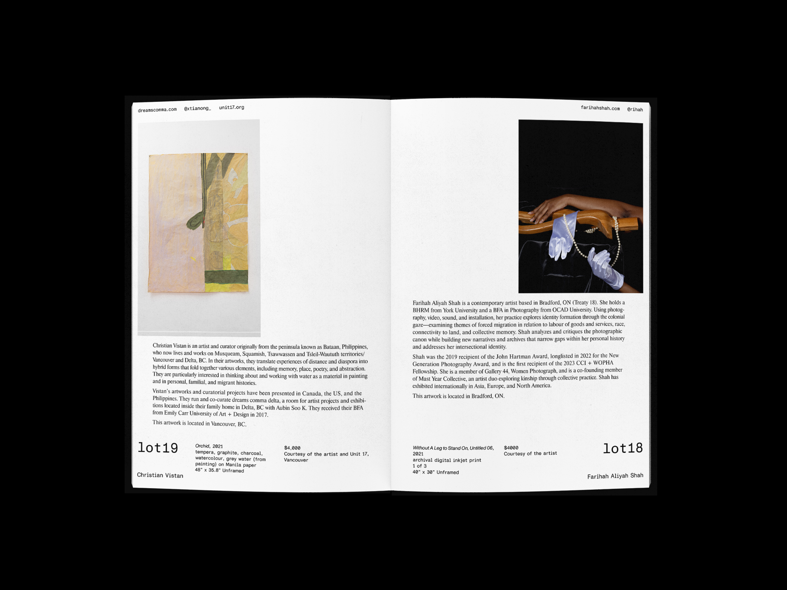
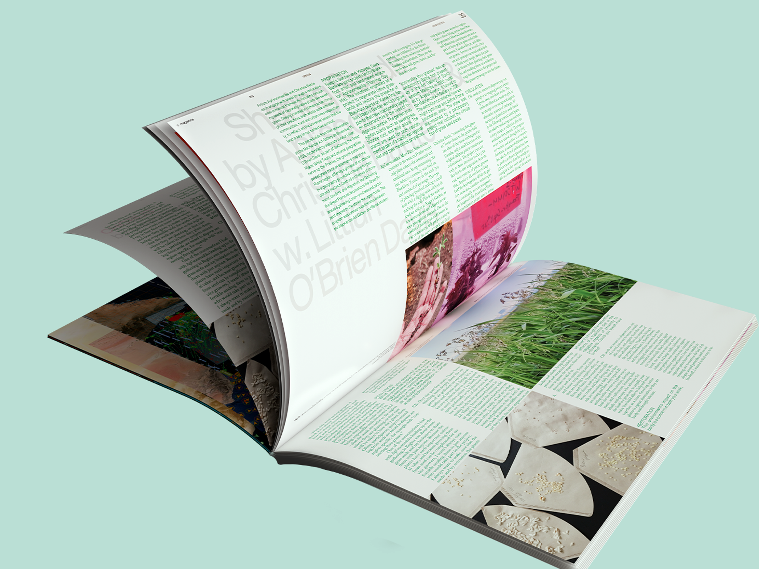
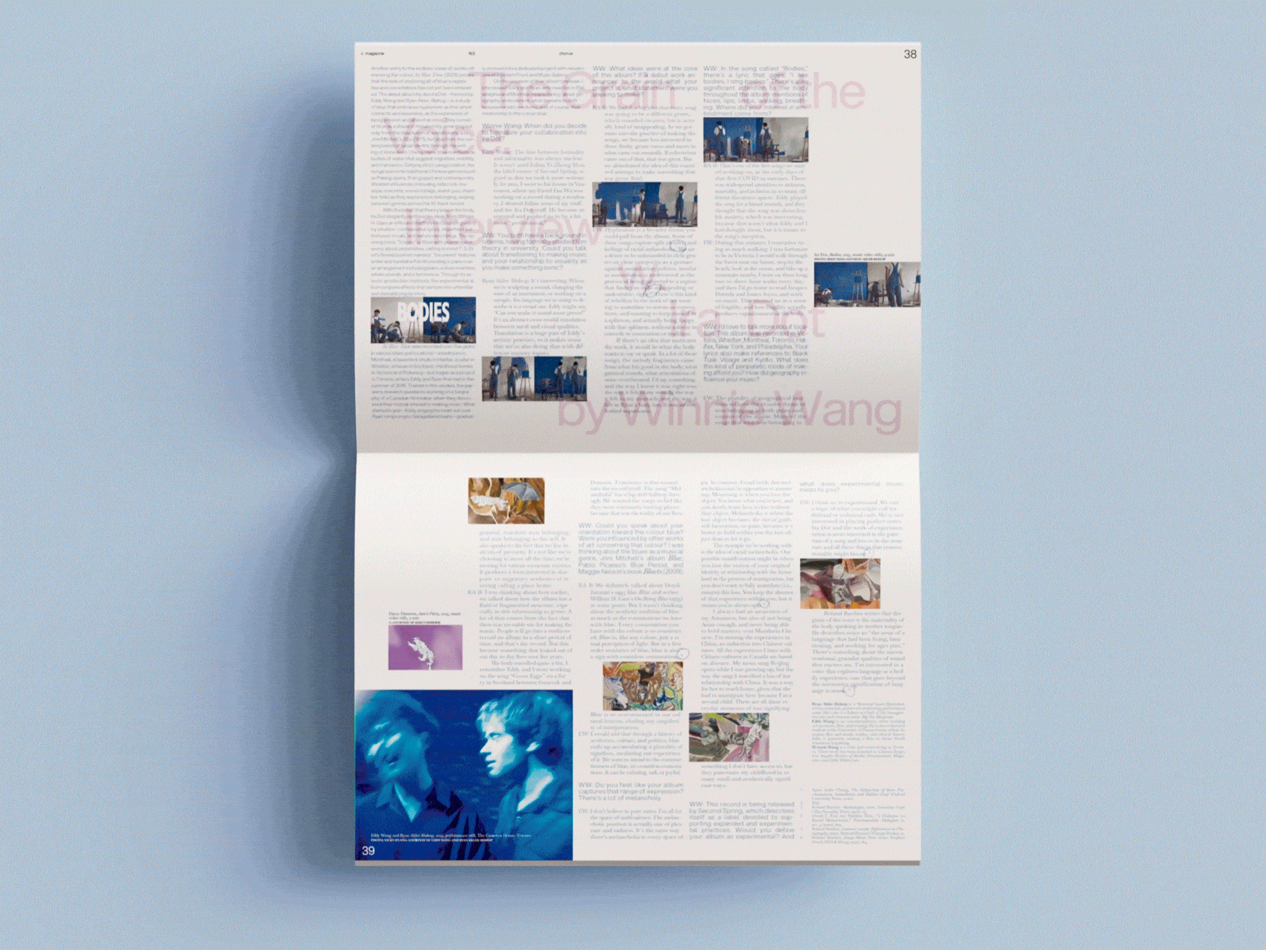
Meaningful graphical treatments—like blue analog pen marks circling citations—and scanned textures are layered atop pages to breathe further life to an article's environment.
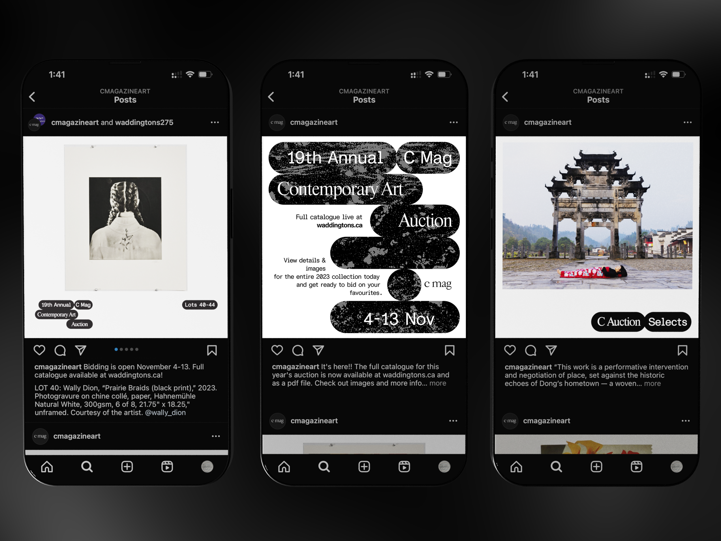
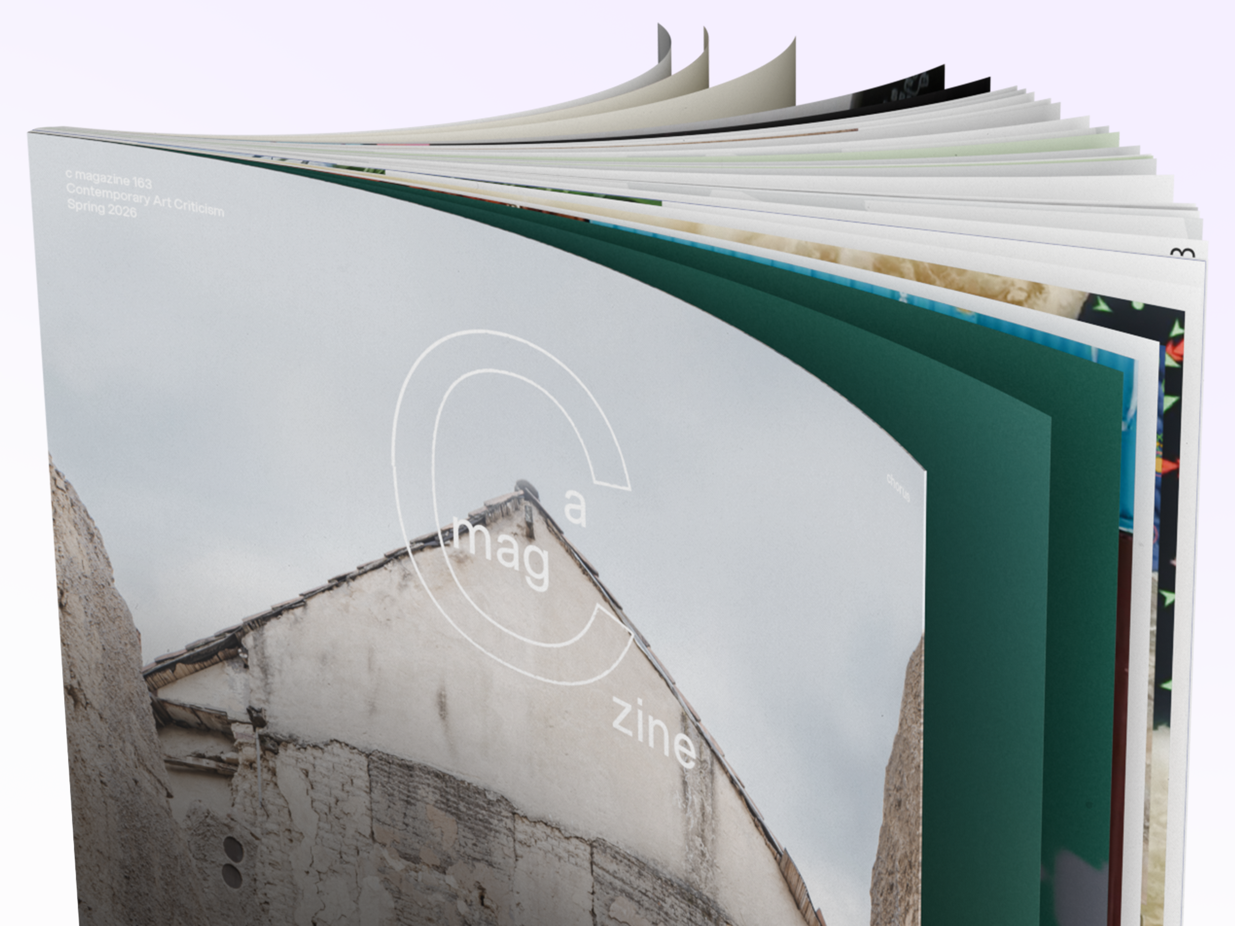
A column grid that fits portrait and landscape orientations weave the multitude of works together, creating a dynamic visual experience that has the reader exploring the printed object beyond the typical reading experience. C Magazine evolves page to page.

C Magazine (est. 1984) is Canada’s foremost critical periodical on contemporary art & culture. Covering Canadian and international art, C includes among its contributors nationally and internationally renowned critics, curators, scholars, & artists. Each issue’s specific thematic focus offers a forum for the in-depth exploration of a relevant topic. C’s print edition is published three times a year, & distributed throughout Canada & Europe.
Catalogue, Social Media & Print Ad Assets /
Design Director

Client: C Magazine

Every year, C Magazine hosts an art auction featuring works generously donated by artists working in painting, photography, sculpture, textile, & beyond; profits directly support C Magazine in its mission to engage our community through Canadian-led contemporary art & art writing.
    Speech bubble shapes visually organized into something not unlike back-and-fourth comic dialogue created the basis of the catalogue's design language. A traditional auction is snappy, with a speedy back-and-fourth carried out between the auctioneer & audience; using the classic visuals of speech bubbles to embody auction "conversation" is a playful way of embodying the event.

C Magazine (est. 1984) is Canada’s foremost critical periodical on contemporary art & culture. Covering Canadian & international art, C includes among its contributors nationally & internationally renowned critics, curators, scholars, & artists. Each issue’s specific thematic focus offers a forum for the in-depth exploration of a relevant topic. C’s print edition is published three times a year, & distributed throughout Canada & Europe.
Identity Design & Branding /
Art Director & Illustrator

Client: DesignTO

DesignTO Festival is an annual week-long celebration of art & design taking place across Toronto. With this being the first time since '20 that the festival would be in-person, I felt a responsibility to connect festival-goers with an experience centered around physical form. As such, my design process was driven by the goal of imbuing the festival’s illustrations with feelings of journeyed paths & zeal.
     Bending & folding 3D forms were created in representation of both the myriad of creative works exhibited during the Festival as well as the walking paths patrons take through exhibits. These shapes emerge from layers upon layers of transparent gradient, tied together by a wandering dotted line that visualizes a patron’s journey exhibit-to-exhibit across Toronto.

DesignTO Festival is Canada’s leading & largest annual design festival that celebrates design as a multidisciplinary form of creative thinking & making, with 100+ free exhibitions & events forming Toronto’s design week every January.
Typographic Logo /
Illustrator

Client: Ka Yan

Emergence, healing, energy—these are keywords which began a wayfaring journey into the creation of a seal & logo for artist Ka Yan's healing, online presence.
     What better represents Ka Yan than the first character of her name—家, which means "home". The evolution of the character was studied, & we fell upon a form that is neither here nor there. I strove to bring out the emotion & history of this character, using ink calligraphy to capture its essence on paper. This was then used to create a negative stencil by which gradient pencil dotting was applied, forming the very emergence we sought to visualize. To ensure that the textured essence was well-visualized no matter the environment, two versions—a finely dotted seal, & a medium sized, screentone-patterned logo were hand drawn & pencil-dotted, meant to live in a large format & small format, respectively.

Ka Yan is a multidisciplinary artist & creative hailing from Hong Kong who has exhibited at the NY Art Book Fair & MoMA PS1. Her photographic monograph, "520", can be found in the collections of the Irene Lewisohn Costume Reference Library of the Metropolitan Museum & the Asian Art Archive in America.
Fashion Graphics /
Graphic Designer

Client: KOZABURO (NYC/TOKYO)

What if friends got together & collaborated with a fashion brand...just because? The NYC-based, Bowling is Divine club did just that, working with lauded Japanese designer Kozaburo on a capsule collection that balances the casual yet passionate nature of an unserious social club.
    Visualized in a riffed-on '100' emoji that is the defacto emoticon of the group chat, & a graffiti'ed version of the club's catch-phrase, the capsule focuses on unserious clothes—sweats, ballcaps, & hoodies—for unserious people & unserious activities. Stocked at worldwide retailers, including BEAMS JAPAN (JP), DOMICILE TOKYO (JP), Cave Osaka (JP), 101 WESTSIDE (JP), TOBIRA STORE (TW), Huiben (NYC) & more.
Read the club's New York Times' article here.

KOZABURO is a utility wear label by 2017 LVMH winner Kozaburo Akasaka, inspired by the karate "kimono" that designer Kozaburo Akasaka has worn since his childhood. The new classic wear fits the lifestyle of the 2020s or even further into the future, regardless of generation, gender, body shape, or race, based on the spirit of "Enryu" (harmony & coexistence of individuals with each other). The three-dimensional silhouettes created by patterns that takes into account the body's structure is light & weightless. Each detail that can be customized by the wearer offers unlimited possibilities, even for everyday wear.
Website & poster design /
Coder & Designer

Client: OCAD U
Test the website's interface here!

The OCAD U Design Department hosts lecture series throughout the year. A website & several digital posters were created for marketing purposes.
     The intent was to create a concept that would be equally as interesting as email posters & as a website. Research & process both initialize a search for a something that aids in the maturation of one’s project. I visualized this idea with colour variations & the use of blur to mimic the drift of focus/out-of-focus that we seem to fluctuate through as we undergo making. As you move your mouse across the screen, colours paint the display; a click erases all strokes. Because the posters are not interactive, how the strokes interacted with the type was adjusted to maintain legibility all the whilst maintaining the visual theme.
Social Assets /
Design Director & Illustrator

Client: C Magazine

Vitamin C is an event series bringing readers and art enthusiasts live seminars, art talks, workshops, and more, all revolving around themes of energy, community, and bursts of well-needed creative nutrition.
     Social media 'stickers' are created in the vein of fruit stickers, and used to denote on an Instagram feed that a Vitamin C event is incoming. These are meant to be used in bundles of three, such that the phrase "Vitamin C Programming" are whimiscally spelled out. Bright colours and fun illustrations collide with the cheekiness of fruit stickers to impart to viewers feelings of excitement and energy.

C Magazine (est. 1984) is Canada’s foremost critical periodical on contemporary art & culture. Covering Canadian & international art, C includes among its contributors nationally & internationally renowned critics, curators, scholars, & artists. Each issue’s specific thematic focus offers a forum for the in-depth exploration of a relevant topic. C’s print edition is published three times a year, & distributed throughout Canada & Europe.
h
@hwa
el
lion
lo@h
art
w
an
ajn.co
old
m